U T O P I A
A visionary study of the urban utopia
LEVEL THREE FOUNDATION DIPLOMA IN ART AND DESIGN UNIT FIVE:
PROPOSING AND REVIEWING A MAJOR PROJECT IN ART AND DESIGN
RESEARCH
Ideal Cities
Research
The “Ideal City” in three Renaissance paintings
One of the main points of inspiration i have taken for my project is the ideal city Italian Renaissance paintings, created within the historical period between 1400 and 1500. Below we present three paintings of the time (in the cover together through Photoshop to show the mutual affinity) intent on depicting the utopia of a perfect city.
Similar but different, they are inspired by the concept of Copy et varietas theorised by Leon Battista Alberti. All they want is to act as the definitive vision of the idealised concept of the ideal city – they are represented by the culture of the time. When we look at the city of the future, represented by contemporary architects, or when we think of those proposed during the twentieth century, surely we are facing a completely different idea … Many things have changed after all.
The Ideal City
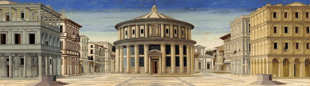
The most famous is the ideal city commissioned by the court of Federico da Montefeltro – The artist is still unknown, but one can imagine that the author was one of the painters who at the time revolved around the Duke of Montefeltro; or Piero della Francesca, Luciano Laurana, Francesco di Giorgio Martini. What distinguishes the work is the perspective view and the general order of the painting as well as what it represents. Ever since Plato has begun to talk about urban utopias or ideal cities, here we see probably the best depictions of these in the history of man. I do not mean that these are the final model for cities of the future, but the representation technique detaches all the great architects newer.
The style prospective frames a perfect city, orderly, accurate in every detail; from decorations of the windows to the pavement. At the center of the square there seems to be a great Baptistery, around which is distributed the large public space. In this context, we note the total absence of persons
The Ideal City of Baltimora
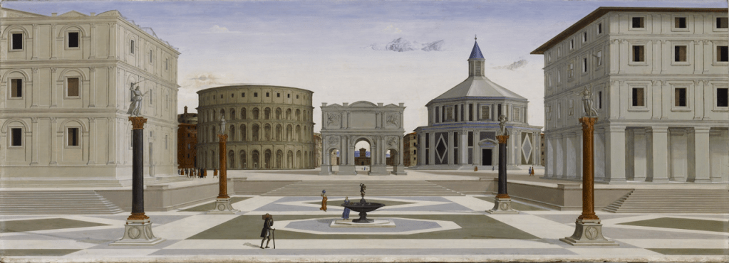
Another View of the ideal city is located today at the Walters Art Museum in Baltimore. Even this painting was born from the court of Urbino and is implicitly recognised by one of the three authors mentioned above. Here you have a perspective view, developed horizontally as in the other three paintings, where the symmetry is given by the two buildings side – different only thanks to the decorations – while the central part of the painting, is dominated by three classical monuments: a amphitheater, a triumphal arch trifornice and a building with a central plan, (probably a reworking of the Baptistery of Florence).
Here too, the square itself is the element that holds together the ideal city. In this case is lowered by a few steps, and contains in its interior four columns with statues on the top and a central fountain.
The Ideal City of Berlin
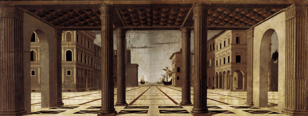
In Berlin, Gemäldegalerie is located a third ideal city. Although the subject, technique and style of the prospective are the same with the previous two, this board is different in many aspects. Among the most important we note that the view is captured from a loggia, from which jut deep into the lines of perspective highlighted by the design of the pavement, which leads the eye towards the harbor. In this context it is useful to focus on the intent that the author wanted to give respect to the proximity between city and port.
References
Research
The First City, from the Twelve Ideal Cities project
Superstudio’s Twelve Ideal Cities project is a wry comment on twentieth-century modernist utopias, and it supposedly represents “the supreme achievement of twenty thousand years of civilization.” In the First City, or 2,000-Ton City, shown here, cubic cells stacked atop one another form a continuous building that stretches across a green, undulating landscape. Each cell is equipped with technology capable of accommodating all human desires and physiological needs. In this city, humans are in a state of equality and death no longer exists, but if an inhabitant tries to rebel against this ideal state, the ceiling of his or her cell will descend with a two-thousand-ton force, obliterating the dissenter and making way for a new perfect citizen.
Superstudio’s Twelve Ideal Cities project is a work i have previously come across. It is a piece that i like very much and one that instantly came to mind to use as a reference for my project. On the right i have additionally included my analysis of the work.
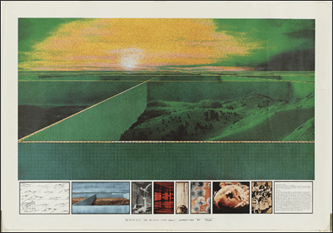
The image above entitled “The First City, from the Twelve Ideal Cities” project is photolithograph, created by a collaboration of four Italian artists for the 75 years of architecture exhibition. The artwork itself was created in the year 1971. I would say that by understanding the geopolitical environment at this time, I am able to make inferences about the meaning of the artwork.
First of all, I am interested with the artists choice of composition and space. In particular, the way the artists have used the relationship between the foreground and background to convey their message. This is because the two-point perspective of the image creates a vanishing point that gives the appearance of a possibly infinite structure. Because of this I would say that this creates a vast sense of depth for the viewer. In addition to this, I would also say that due to the chosen perspective we are also able to see the repetition of the cubes, this is significant because it instils the viewer the impression of infinity. This also creates pathways along the tops of the geometric shapes for the viewer’s eye to follow. I would also say the dominant structure within the image is the walls that tower over the obviously large hills of the landscape, I would say that this also gives the viewer a sense of scale further highlighting the vast scale of the structures.
The artists have also created strong lines throughout the image, this use of geometry instils the viewer with a sense of structure. I would also say that by highlighting the tops of the walls it draws the viewer’s’ attention to the fact that the walls do not go all the way up therefore evoking a sense of hope. Furthermore, another way the artists have used line is in the cubes of the walls, these give the viewer the impression that the structure is strong and robust.
Additionally, another aspect I found particularly striking was the colours used in the image as I would say that this creates a surreal ‘dreamlike’ atmosphere. The artist decision to make the walls green is also interesting to me as this may have been intentionally done to make the walls blend better with the landscape, suggesting that the walls are just as much part of the landscape as the hillside. I would also say that by the tops of the walls being yellow, the artist have been able to add an aspect of realism to an otherwise surrealist image by creating the illusion of the sunlight hitting the tops of the walls. Furthermore, I would also say that the colours chosen for the sun makes it unable to decipher if the image is taken at sunrise or sunset, I would say that this was intentional of the artists as it allows the viewer to interpret the image subjectively. Furthermore, I would also say that the choice of green also creates a science fiction appearance, this again adds to the atmosphere of the piece.
The image itself is said to depict the “ideals of twentieth-century modernist utopias”. To me this suggests that the work is challenging the idea of “utopia” and if such a thing could really exist at all. Furthermore, the artists have also created a mood bored at the bottom of the piece, including preliminary ideas and images regarding the subject. I believe they have done this to make the main piece less ambiguous and allow the viewer to better understand the message they are trying to portray. This was particularly interesting to me because it allows that artist to tell a story to the viewer. I would also say that by doing this the artists have been able to make people’s interpretations of the piece more personal as each image will offer a new perspective on the artwork. In addition to this, the artwork itself was created in 1971, I believe this allows me to better understand the intentions of the artists, as I would say that that the artwork is highly expressive of the attitudes to the future that many people had during this time period. For instance, during this time there was lots of environmental consciousness and activism, one way I believe this is shown in the piece is that the landscape feels like it is framed by the walls, perhaps suggesting an effort to preserve it. Moreover, I would say that there is a strong conflict between contrasting pessimism and optimism portrayed by the appearance of the sun being in a state of both sunrise and sunset. This therefore leaves the image up for interpretation. Because of this, I would say that this image is subjective and could be interpreted as rather highly positive or negative. In contrast to this, another idea could be that the walls instead represent a reflection of the old world or how the world still was in this time period, rather than in the future. This could mean that the walls instead represent segregation, in particular the inequalities of the class system around this time. Furthermore, another approach to this could be the artists decision to only show the contents of the first cube, here the artist could be saying that our perception of the world is conformed to only what is within our cube, and that we are therefore trapped within our own interpretations of the world.
Personally, I believe that the piece has a strong emotional impact, my initial reaction when viewing the artwork was intrigue, a desire to know what was in the rest of the cubes. I would say that this again links to the idea of pessimism and optimism as I would say that someone who is pessimistic may instead feel a sense of fear or uneasiness about not knowing the contents of the other cubes. Therefore, I would say that the artwork could represent the fear of the unknown as in the description the image it is described to be a “utopia” however I would argue that that choice of colour instead creates cold and isolated appearance.
One element that has been successful in this artwork is the use of colour to create the distinctive atmosphere, particularly in the choice of colours in the sunset that leave the interpretations of the image up to the viewer, because of this I would also say that the artwork is extremely unique and original. I would also say that one of the most important elements of this artwork to consider is the time in which it was created. Because of this I would argue that the piece is a comment or even criticism of the global ideals of the future. By creating a visual representation of this, the artists are able to connect with the viewers on a personal level. I would say that the piece as a whole challenges the viewers personal concept of “utopia” by suggesting that such a thing would not be more desirable than what we have already achieved as a society and perhaps encourages people to take a more optimistic outlook on their current situation.
References
Precedents
Researching existing architectural proposals for the urban utopias
existing architectural proposals
Research
Saltaire
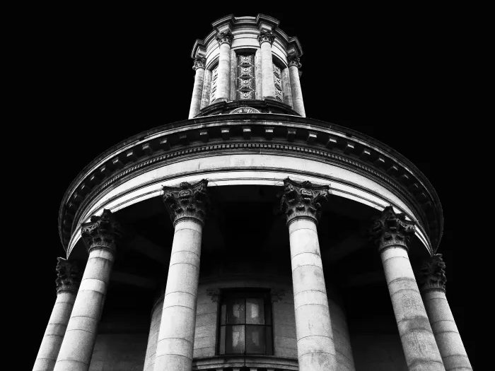
The United Reformed Church
The United Reformed Church, formerly known as the Congregational Church
A local example of an existing architectural proposal for the urban utopia is Saltaire.
Heritage information
Saltaire takes its name from its founder, Sir Titus Salt (1803-1876), and the River Aire, which runs through the village. Salt made his fortune in the Bradford textile industry, manufacturing fine woollen fabrics. Determined to escape the polluted and overcrowded town centre for greener pastures, he made a bold decision to relocate his business and his employees.
Local architects, Henry Lockwood and Richard Mawson, were employed to plan a new community where Salt’s workforce would be healthier, happier and more productive. Work began in 1851 and continued until 1876. Salts Mill was the first building to be complete in 1853.
Lockwood and Mawson designed the entire village in a classical style, inspired by the Italian Renaissance. Their finest work was Saltaire United Reformed Church now a Grade 1 listed building.
Housing was provided of the highest quality. Each had a water supply, gas lighting, an outdoor privy, separate living and cooking spaces and several bedrooms. This compared favourably with the typical worker’s cottage.
Salt was also one of greatest Victorian philanthropists. He donated liberally to good causes locally and nationally. Almshouses were provided rent-free for the elderly and sick in Saltaire. They came with a pension, forty years before the first state pensions in the United Kingdom.
By the 1980s the British textile industry was in steep decline. Production was scaled back and Salts Mill was finally closed in 1986. To the rescue came another brilliant entrepreneur, Jonathan Silver who bought the Mill and within months opened a gallery exhibiting the work of Bradford-born artist David Hockney. During the 1990s more of the mill was brought back into use and filled with business, shops and the famous Salts Diner.
Saltaire was inscribed on the UNESCO World Heritage List in 2001. It was recognised for its international influence on town planning and as one of the earliest, largest and best preserved nineteenth century ‘model villages’ anywhere in the world.
Further changes have taken place recently. With extensive investment from the Heritage Lottery Fund and Bradford Council, Roberts Park has been restored. A new bandstand and children’s play area have been added and the buildings and landscape repaired and revitalised.
References
https://www.visitbradford.com/saltaire-history.aspx
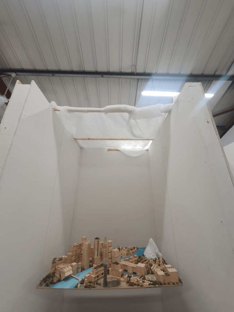
Model Making
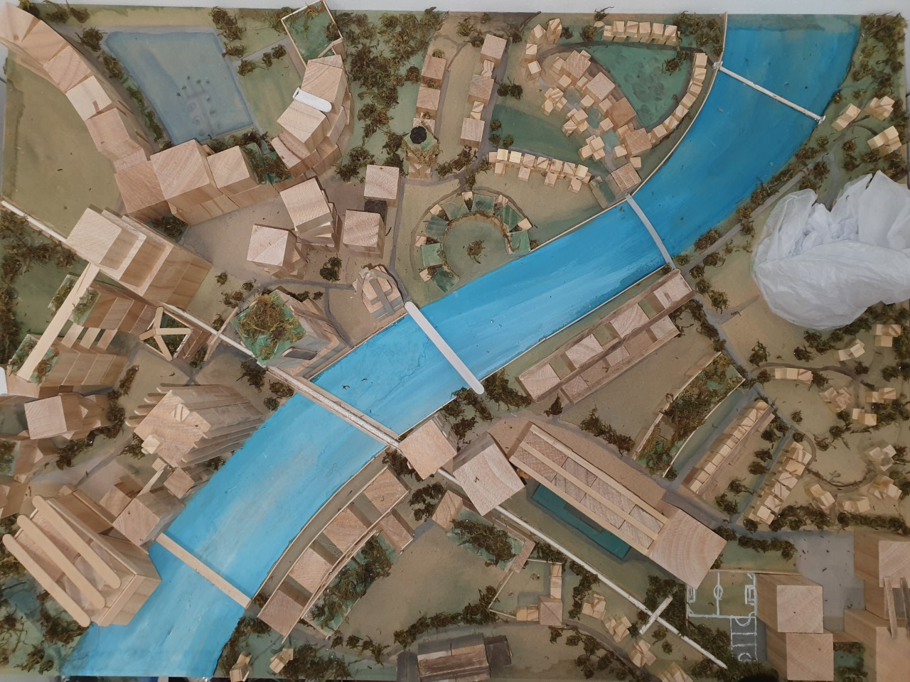
Exhebition